
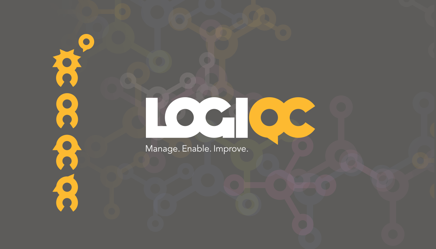
LOGIQC Quality Management System
LOGIQC (pronounced LOGIC) is a cloud-based, easy to use Quality Management System, which was designed to help assist company managers and their staff manage critical tasks relating to quality, safety, risk, compliance and business improvement, particularly in the health sector. REB Design was engaged to develop the brand name, brand identity, trade fair graphics and associated marketing collateral. As Quality Control (QC) procedures are integral to all QM systems, the acronym QC became an integral part of the LOGIQC name and brand. At a secondary level, the QC device was re-interpreted as a 'family' of people, which represents the employees within a company.
Client: 20|20 Integrated Solutions, Brisbane QLD
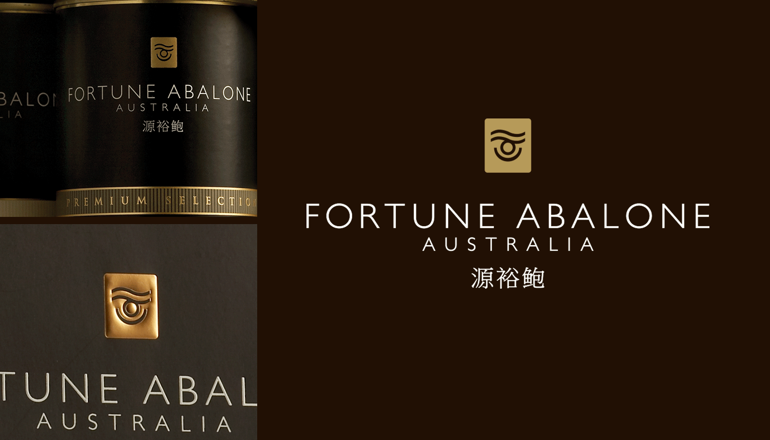
Fortune Abalone Australia
Abalone is renowned globally as a delicacy, while in China it is also considered a luxury item worthy of reserve for special occasions. More often than not however, the premium status of the product is poorly reflected in its branding and packaging. With this in mind, Fortune Abalone Australia approached REB Design to manage a broad branding and packaging program, which would add value to the produce on offer in its superbly finished retail outlet in Chatswood, Sydney.
Client: Fortune Abalone Australia, Sydney NSW
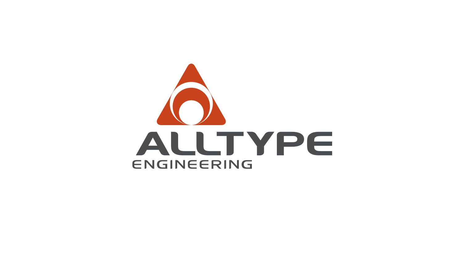
Alltype Engineering
Alltype Engineering is a specialist provider of pipework systems, structural steel, plate fabrication and site installation services to the water, mining, infrastructure and oil & gas industries. REB Design was engaged to manage its re-branding program, which included signage to its greenfield site in Naval Base.
Client: Alltype Engineering, Naval Base WA

Sandalford Wines
Sandalford Wines is synonymous with the production of fine Australian Wines across Australia and overseas. REB Design was engaged by the company over a period of years to design its premium and lesser premium labels as well as the Sandalford banner, which included the re-interpretation of the heraldic deer motif.
Client: Sandalford Wines, Caversham WA
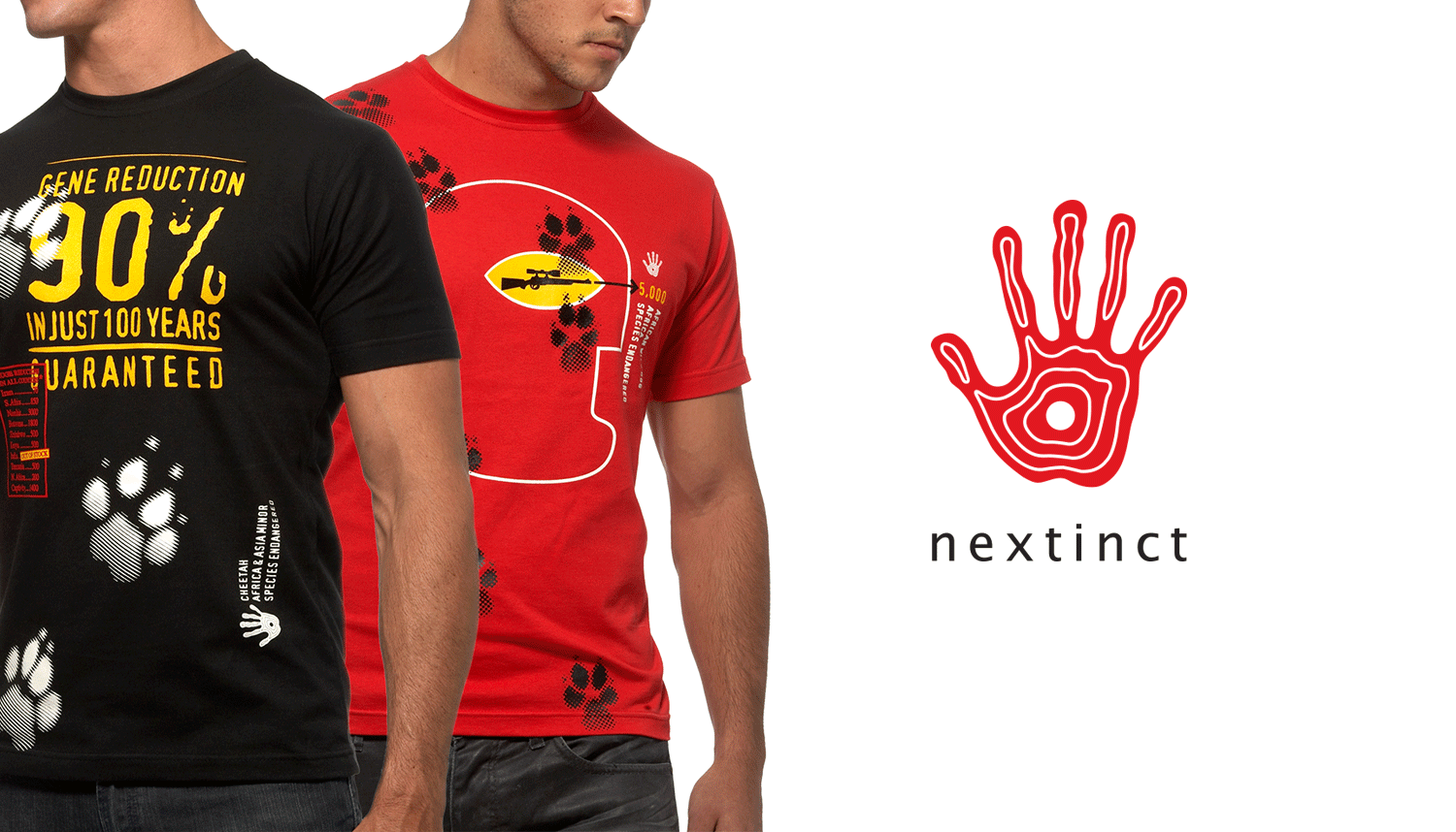
Nextinct
The Siberian Tiger, Hairy Nosed Wombat and Black Rhinoceros may live on different continents, but they all have one thing in common – they’re critically endangered. Very few people have any idea as to how close to extinction numerous species across the globe are, and even more importantly, how mankind is exacerbating the problem. With this in mind, REB Design was commissioned to develop the brand name, a branding program, marketing material and a range of graphically arresting planet-aware apparel, which would have broad consumer appeal while highlighting the plight of various endangered species across the planet.
Client: Nextinct, Perth WA

Three Ocean Maritime
Three Ocean Maritime is Australia's leading provider of hold cleaning, hold separation and cargo services to all ports around Australia. In 2010, the company directors elected to commission a re-branding program to fit with their vision of future growth. REB Design provided a raft of brand identity services including the development of the new identity, print collateral, website design and vehicle livery. Central to the program of works was the development of the strong brandmark. The acronym, TOM, underpins the 'strong partner' ethos of the company, while the sceptre and aqua colourways provide symbolic links with the maritime industries the company services nationally.
Client: Three Ocean Maritime, Naval Base WA
Photography: Gale Force Photography
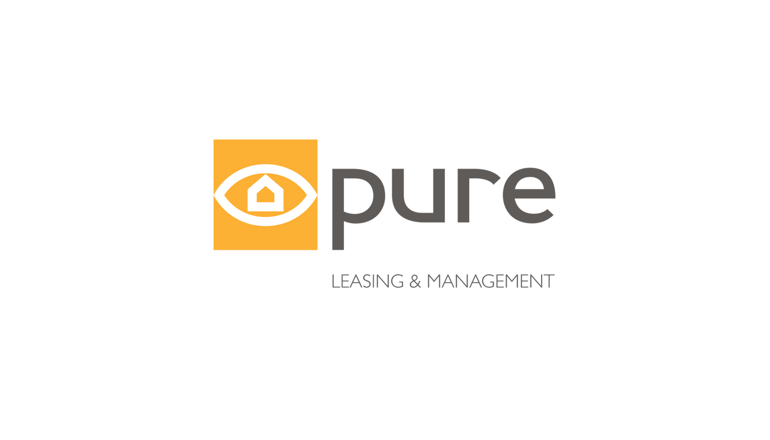
Pure Leasing & Management
Pure Leasing & Management was created to address a significant shortfall in service levels across the property management industry, which is predominantly driven by sales based practices that underpin the existence of many successful real estate companies. The driver for the principal/licensee was to create a company that put the leasing and management of properties as its ‘pure’ focus. The ethos of the company, particularly its 'focus', was captured in the clean, contemporary identity developed by REB Design of a building within an eye. REB Design also managed the design of print collateral and signage for the company's Subiaco office.
Client: Pure Leasing & Management, Subiaco WA
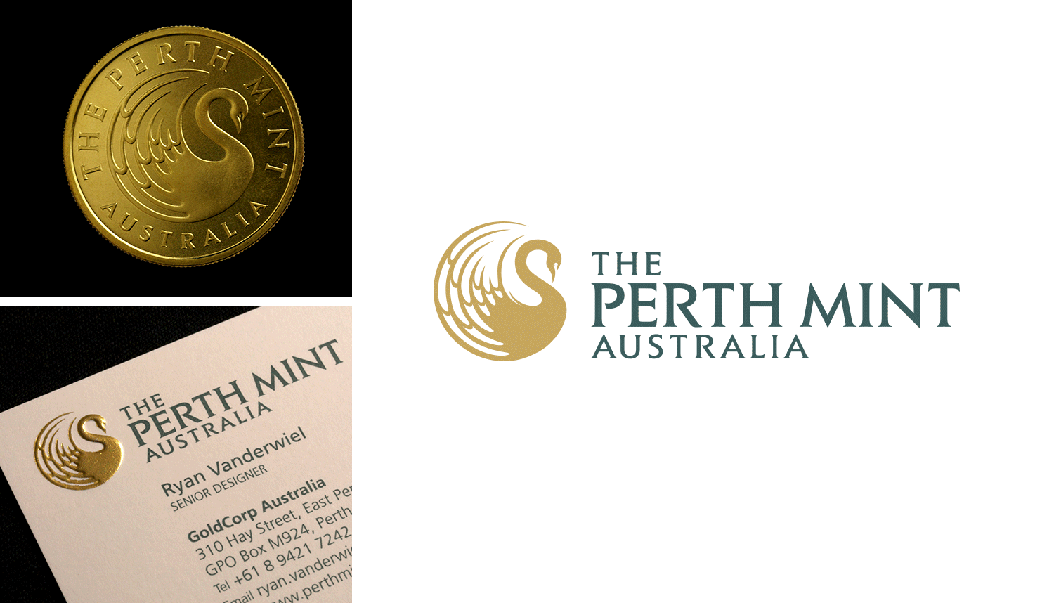
The Perth Mint
Tradition, craft, heritage and value. These words underpinned the re-branding strategy REB Design was commissioned to manage for The Perth Mint, Australia, which has an enviable international reputation for its minted products and its precious metal depository. Central to the program was a new identity, a stylised image of a majestic swan, which maintains strong visual links with the organisation’s original marque. The all-encompassing re-branding program, which took the better part of twelve months to be realised, included a brand audit and analysis, the styling of a broad range of communication material and the development of a comprehensive style guide to ensure consistent brand management in the years ahead.
Client: The Perth Mint, Perth WA

DEKK
DEKK is a recently new name in rubber tracks and pads that is destined to become synonymous with tracked construction machinery across Australia. REB Design was approached to manage an integrated branding program which began with the development of the arresting brand name and identity, followed by the creation of marketing material and an associated website which would set the brand apart in its sector
Client: CPS Wear Parts, Forrestdale WA

The Giving Tree
The Giving Tree is an exclusive gift shop with a strong focus on sustainability and modern design. Located in the heart of the highly regarded Claremont Quarter, REB Design was appointed as graphic designers to develop an identity, which would marry with the vision and offer of the company. What resulted is a slightly whimsical yet distinctly modern interpretation of a tree for the identity, which was carefully translated to carry bags and print collateral.
Client: The Giving Tree, Claremont WA

Crown Integrated Systems
Crown Integrated Systems is a supplier of monitored security services, structured cabling, CCTV and ducted vacuum systems. REB Design was engaged to re-design the company’s identity and apply it to corporate stationery, marketing material and vehicle livery.
Client: Crown Integrated Systems, Joondalup WA
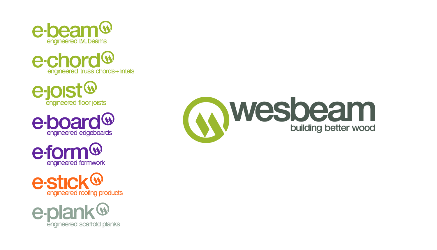
Wesbeam
Wesbeam is a producer and supplier of laminated veneer lumber (LVL) in the Australian market. The company engaged REB Design to develop a comprehensive branding and communication program to assist with its market penetration across the country. Fundamental to the program was an analysis of major competitors as well as the development of a clear understanding of Wesbeam’s product features and USPs. The scope of services provided included strategic consulting followed by the development of the parent brand Identity, sub-brand names and identities, positioning statement, as well as marketing material, technical catalogues and trade advertising.
Client: Wesbeam, Neerabup WA

Case Couture
Make-up and its application, particularly in small, poorly lit spaces, can be the bane of many a woman, hence a range of highly desirable make-up cases and application accessories by Case Couture was developed to remedy the problem. The brief to REB Design was to develop a brand identity, which would have classic influences and at the same time work effectively when embossed or debossed into the various materials used for the shells of the units, as well as on accessories and in marketing applications. The result is a marque that draws its influences from the flourishes of Rococo and typography reminiscent of that found in France in the early twentieth century.
Client: Case Couture, Perth WA
Photography: Robert Simeon

Hawaiian Property Group
Hawaiian is a Western Australian based property group, which owns and manages an extensive Australia-wide commercial, retail and hospitality portfolio. REB Design was commissioned to re-image the company, which included the development of the identity, corporate stationery and promotional print material.
Client: Hawaiian Property Group, Perth WA
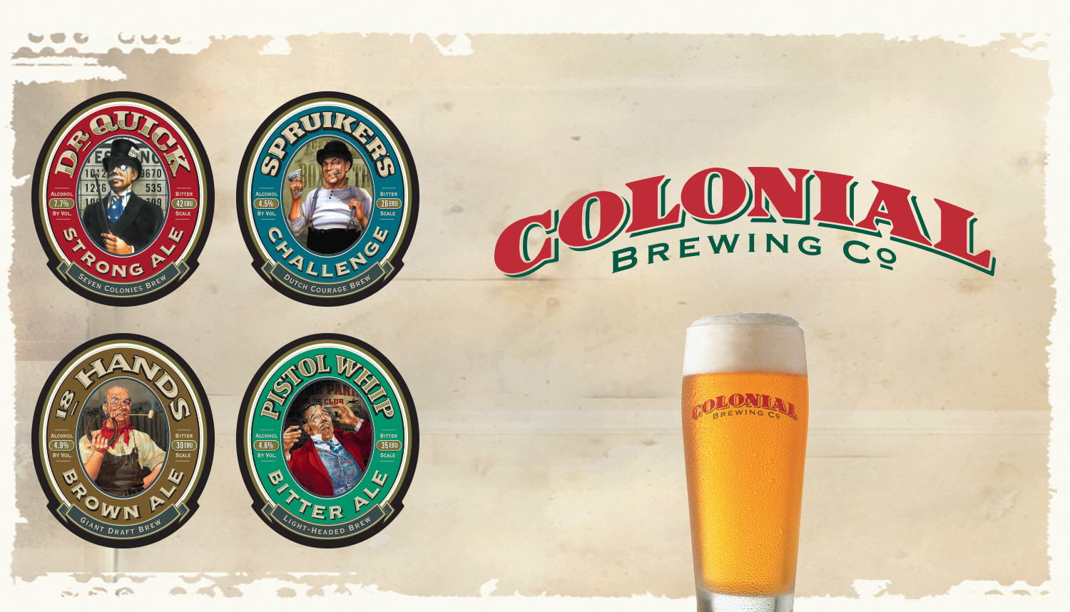
Colonial Brewing Co.
REB Design's development of the parent brand and associated sub-brands for Colonial Brewing Co. was driven by a requirement to create a memorable family of brands that would work well together or when standing alone. Designed for on-tap premise identification, the sub-brands became the platform of a brand culture that was applied across the pub-brewery interior, website and promotional material.
Client: Colonial Brewing Co., Margaret River WA
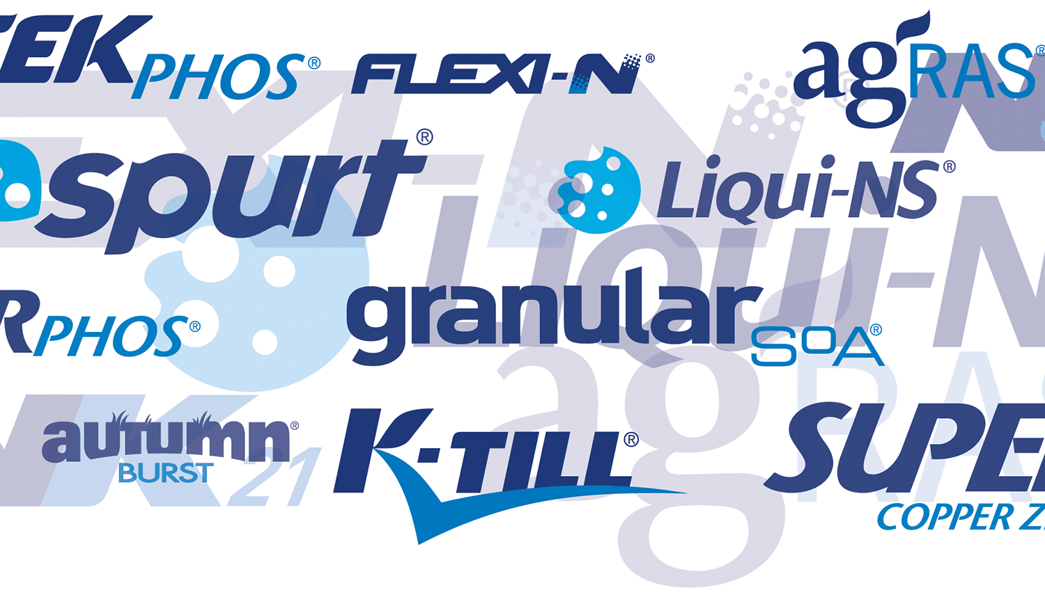
CSBP Fertilizers
CSBP is recognised as the largest supplier of nutrient products to thousands of farming enterprises across Western Australia, as well as a researcher and developer of innovative fertilizers and diagnostic services. REB Design worked in close consultation with the company’s marketing department over a number of years to develop the brand identities of the entire range of granulated and liquid fertilizers products, as well as the tools to promote them to the broader rural community. The program required close consultation with farmers, agronomists and technical staff, and the development of a brand culture, which percolated through all levels of communication within the company and the marketplace.
Client: CSBP, Kwinana WA
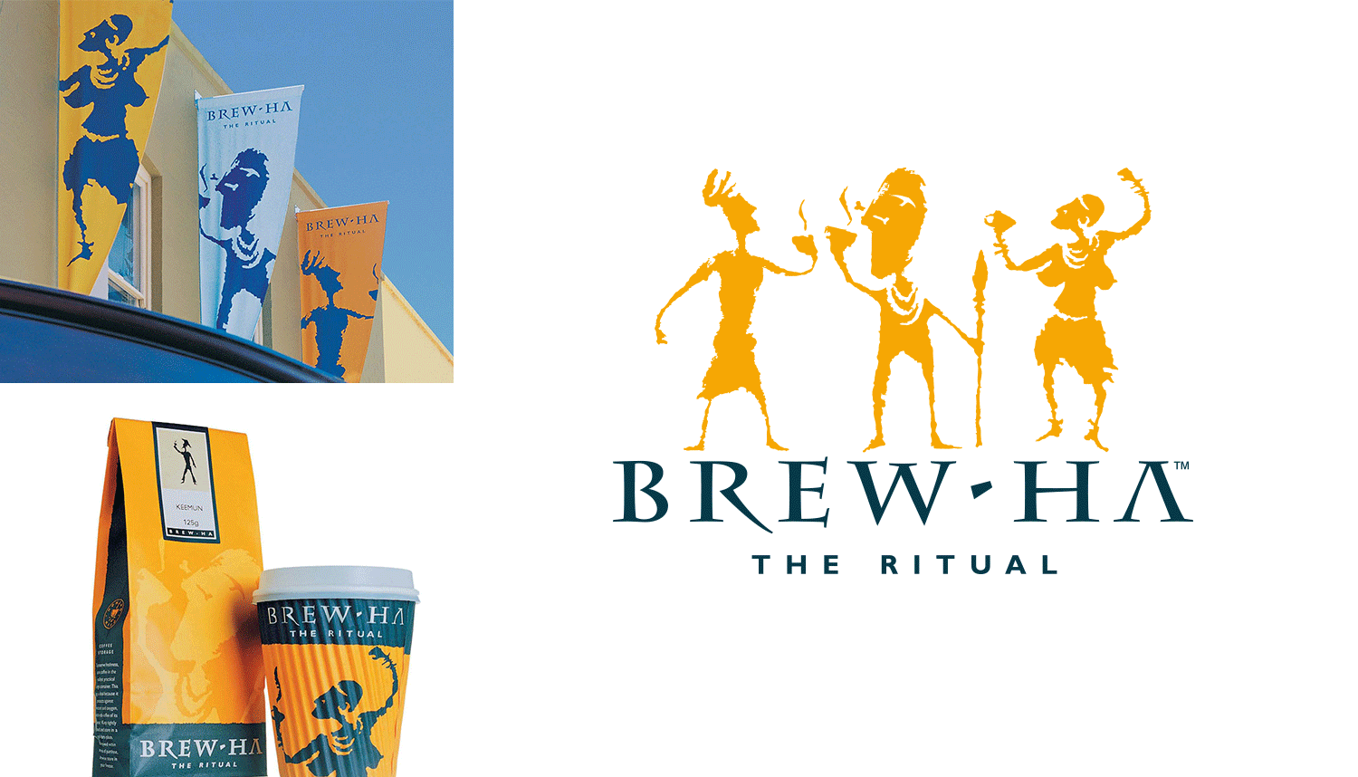
Brew-Ha
Brew-Ha is a speciality coffee roaster and importer of fine loose-leaf teas, which operates a café/retail outlet facility in Subiaco, Western Australia. The company also has a dedicated wholesale distribution and roasting facility, which provides fresh roasted coffee to cafés, restaurants and hotels across greater Perth and Western Australia. REB Design was responsible for the entire branding program for the business, which included the development of all exterior and interior signage and packaging to marry with the brand culture developed for the company.
Client: Brew-Ha, Subiaco WA
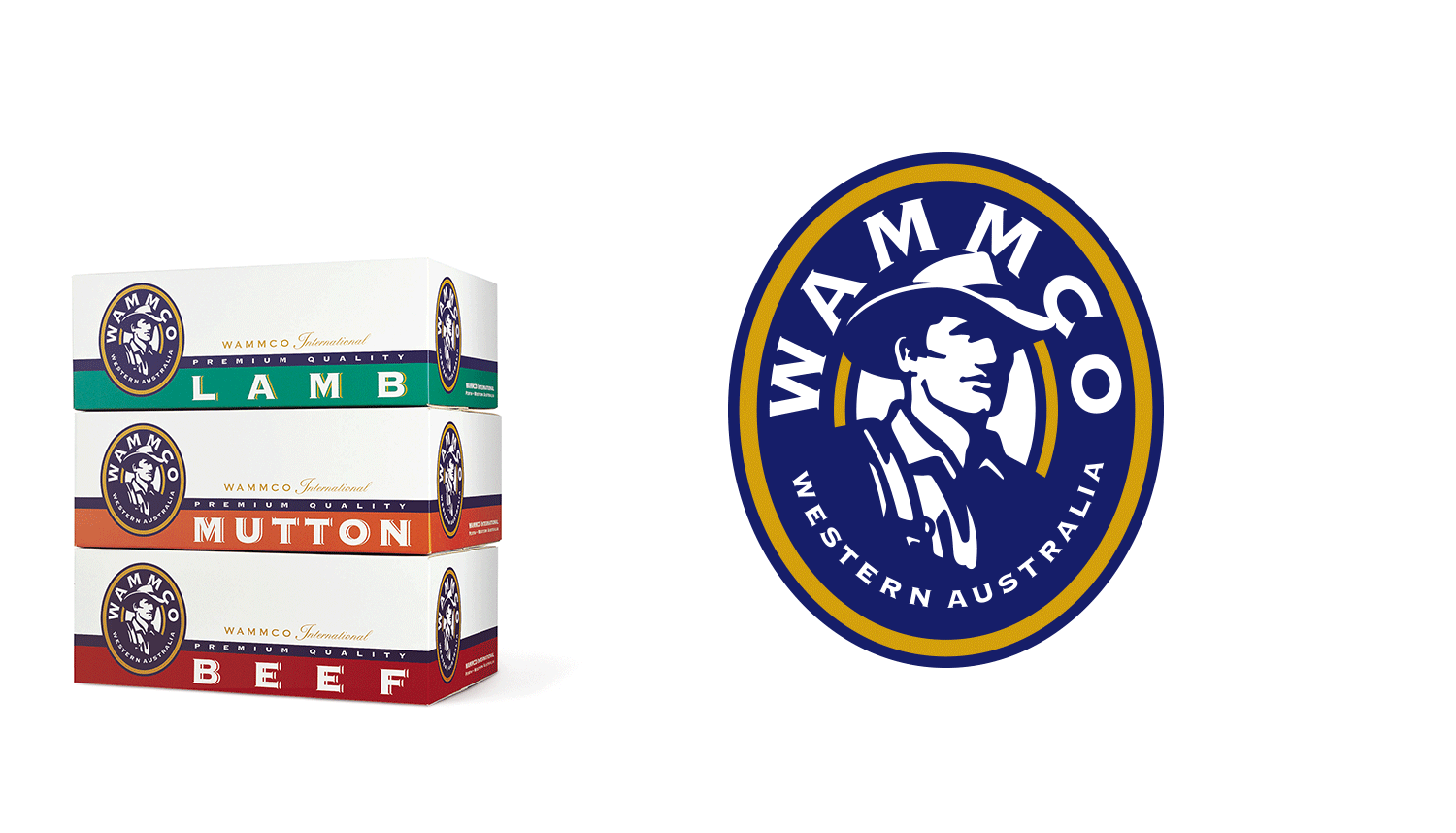
WAMMCO International
WAMMCO International is the trading name of the producer owned and controlled Western Australian Meat Marketing Co-operative Limited. Its core business is the supply of premium quality lamb to the world, as well as lesser quantities of processed mutton, goat and fallow deer. REB Design was engaged to develop the brand identity, Cryovac packaging, bulk shipper packaging and marketing material.
Client: Western Australian Meat Marketing Co-operative Limited

Bunnings Warehouse
Bunnings is the leading retailer of home and garden improvement products in Australia and New Zealand and a major supplier of building materials. Operating from a network of large warehouse stores, smaller format stores and trade centres, Bunnings caters for do-it-yourself customers as well as builders and contractors. REB Design designed the brand identity for Bunnings Warehouse and worked closely with the company for more than a decade to strategically transform its retail face from one that appealed to the stereotypical preferences of male customers to a model that had broader consumer appeal. This success resulted in the roll-out of the retail format and the broad implementation of the branding throughout Australia.
Client: Bunnings, Belmont WA
Logos + Brandmarks + Identities
REB Design has developed a strong reputation for the development of logos, wordmarks or trademarks for a raft of small, medium and large organisations, which have retention value, longevity and measurable worth.